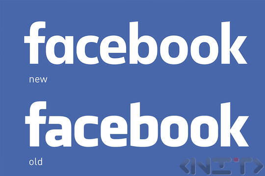
This has been the first change of the logo since the creation of the company in 2005.
Facebook once again collaborated with the designer Erik Olsen, who developed the typeface Klavika, used in the previous logo of the social network. Letters „a", „e", „b" и „o" are rounder and the letter “a” is totally different.
According to a spokesman of the social network, the new logo aims to demonstrate friendliness and accessibility. Moreover, it is obviously more suitable for mobile devices.
So far Facebook favicon remains unchanged.